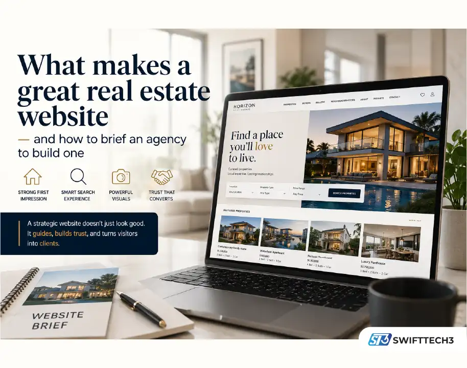
Most real estate websites are doing less than they could. Browse the work of the top real estate website design companies and you’ll notice the gap immediately — between sites that have the right elements assembled without a clear point of view, and ones built around what a visitor actually needs at each stage of their journey. The first kind provides information but doesn’t guide anyone toward a decision. The second kind converts.
This article is about what separates a real estate website that performs from one that just exists — and how to translate that understanding into a brief that an agency can actually use.
The first impression problem
A visitor lands on your homepage having arrived from a search result, a social media post, or a referral from someone they trust. They know almost nothing about you. In the next few seconds, they’re going to decide whether to stay or leave — and that decision is made before they’ve read a single word of your copy.
What they’re responding to in those first seconds isn’t content. It’s feeling. Does this look like a business I’d trust with a significant transaction? Does it feel current or dated? Does it feel like it was made with care?
This is why visual quality matters so much in real estate. A site that looks like it was built a decade ago — regardless of what it says — signals that the business behind it isn’t investing in its own presentation. And if they’re not investing in their own presentation, why would a client trust them to present a property well?
The first impression is set by a relatively small number of things: the quality of the photography, the clarity of the typography, the amount of visual noise on the page, and whether the site loads quickly. Get these right and you’ve bought the visitor’s attention. Get them wrong and the rest of the site doesn’t matter.
Structure: how visitors actually move through a property site
Most real estate websites are structured around the business’s internal logic rather than the visitor’s actual journey. The navigation reflects how the agency thinks about its services, not how a buyer or seller thinks about their problem.
A buyer arriving at your site for the first time is not ready to submit an enquiry. They’re still in the exploration phase — trying to understand what’s available, whether your portfolio matches what they’re looking for, and whether this is an agency they’d want to work with. Hitting them immediately with a prominent “contact us” CTA misreads where they are in the process.
Think instead about the sequence of decisions a visitor makes. First: is there anything here worth looking at? (This is answered by your property search and the quality of your listings.) Second: does this agency know this market? (This is answered by your area guides, market insights, and the depth of your listing descriptions.) Third: would I trust them to represent me? (This is answered by testimonials, agent profiles, and the overall quality and consistency of the site.) Fourth: how do I get in touch?
Structure the site around that sequence rather than around what’s easiest to navigate internally, and you’ll see visitors spend more time on the site and convert at higher rates.
Property listings: where most sites lose people
The listing page is the highest-stakes page on a real estate website, and it’s frequently the least well-designed. Most listing pages are data dumps: a gallery, a price, a list of features, an address, and a contact form. They give the visitor information but don’t tell them anything.
A listing page that actually does its job answers a question the visitor hasn’t explicitly asked: what would it feel like to live here? That means going beyond the number of bedrooms and the square footage. It means describing the light in the morning, the quiet of the street, the walk to the nearest market. It means showing the neighbourhood, not just the property. It means the photography is curated to tell a story, not just document a space.
This sounds like marketing copy, which it is — but it’s also accurate description. A buyer doesn’t just want to know the facts; they want to be able to picture themselves in the property. Listing pages that help them do that generate more enquiries, and better-quality enquiries, than ones that only provide data.
For the briefing conversation with your agency: push them on how they approach listing pages. What’s their template? How flexible is it? What content fields do they include, and what’s optional? A good agency will have thought carefully about this, and will be able to explain the reasoning behind their decisions.
Search functionality: the feature that makes or breaks the experience
The property search function is where most real estate websites either earn or lose a visitor’s patience. A search tool that’s slow, that returns confusing results, or that offers too many filter options before the visitor knows what they’re looking for — any of these will send people away.
The best property search experiences are opinionated about where to start. They don’t give you thirty filter options on the first screen; they give you the two or three parameters that matter most (location, price, property type) and let you narrow from there. They return results quickly. They present those results in a way that’s easy to scan — a map view for visitors who think spatially, a list view for those who prefer detail.
The saved search and alert function is often overlooked but genuinely valuable. A buyer who’s not ready to purchase today but wants to know when something matching their criteria comes onto the market will return to a site repeatedly if it makes that easy to set up. That kind of repeat engagement builds the relationship that eventually turns into an instruction.
When briefing an agency, be specific about the search experience you want. Don’t just say “we need a property search.” Describe the journey: someone arrives at the site, they know they want a three-bedroom house within a certain budget in a general area, they haven’t decided on the specific neighbourhood yet. Walk the agency through that scenario and ask them how their solution would handle it.
Photography and visual content: the make-or-break element
In real estate, the photography isn’t supporting content — it is the content. A listing with weak photography will underperform regardless of how good the rest of the site is. A listing with exceptional photography sells itself.
This has implications for how you think about the relationship between photography and web design. The two need to be considered together, not separately. A design that’s built around a specific image ratio or composition style will look inconsistent if the photography doesn’t follow those conventions. Conversely, great photography displayed in a poorly designed template loses much of its impact.
The agency you choose should have a view on this. Ideally, they should be able to advise on photography direction — not just accept whatever files you send them and build around them. The best real estate websites are ones where the visual system (design, typography, colour palette, image treatment) and the photography work as a coherent whole.
Virtual tours and video walkthroughs have become increasingly standard, particularly for premium properties. If your business is in a market where international or remote buyers are significant, the ability to experience a property comprehensively without visiting in person can be the difference between an enquiry and a bounce. Make sure your agency has experience integrating these formats — both technically and in terms of how they fit into the page design.
Content beyond the listings
A real estate website that only contains listings is a catalogue. A real estate website that contains market insight, neighbourhood guides, and advice for buyers and sellers is a resource — and a resource is something people return to.
This matters for a few reasons. First: repeat visitors convert at higher rates than first-time visitors, because trust accumulates over time. Second: content that’s genuinely useful tends to rank well in search, which means the site gets found by people who weren’t already looking for you specifically. Third: the quality of your content signals the quality of your market knowledge — which is precisely what a client is paying for when they instruct an agent.
The briefing question for your agency is how they approach content beyond listings. Do they have a content strategy as part of their process? How do they build a blog or resource section that’s actually usable, rather than a tacked-on afterthought? Do they think about SEO from the beginning, or is it something that gets addressed after launch?
An agency that treats content as an integral part of the site architecture — not a section to be filled in later — is one that understands how real estate websites actually generate long-term value.
The post-launch relationship
A real estate website is not a finished product. It’s a platform that needs to evolve as your business does, as the market changes, and as you learn more about what your clients are looking for.
The agency you choose should be someone you can work with over time, not just for the duration of the initial build. That means understanding, before you sign anything, what the ongoing relationship looks like. How do they handle small updates? What’s the turnaround time for changes? Is there a maintenance retainer, and what does it cover? Who do you contact when something breaks?
The answers to these questions matter as much as the quality of the initial build. A beautifully designed site that’s difficult to update, or that requires a lengthy agency process every time you want to change a piece of copy, is a site that will gradually become outdated — which defeats most of the purpose of building it in the first place.
Choose an agency that thinks about the long-term relationship as seriously as they think about the launch. The ones that do are the ones whose clients tend to stay with them — which is itself a reasonable signal that they’re worth working with.
Visit: Swifttech3